Page 1 of 2
Chart Constant Lines/Strips/Conditions
Posted: Sun Mar 09, 2014 11:12 pm
by NadinW
Hi there,
I created a ‘scattered line’ graph example report and I’ve attached it for you to have a look.
I’m running (Stimulsoft Reports Wpf version 2013.3.1800)
I noticed few things that seem to be buggy and not working as expected:
1. I added constant line and called ‘low limit’ with colour ‘Red’. The colour appears in the page design but not the Preview.
2. if I change the title text position to Left bottom or Left top I don’t see the title
3. I added strip called ‘Value <=3’ with colour text ‘Red’ and strip brush ‘Solid’ colour ‘Light Orange’ and text colour ‘Red’. again same problem as the constant line I get to see the colour in the design page but not in the preview.
4. After I created a report in the designer and added the coloured (Constant Lines) and (Strips), I saved the report and closed it. When I open the report with the designer a second time it seems that it defaults the Constant Lines and the Strip colours to grey and White and my colours disappeared.
5. I would like to highlight some points with a different colour like any point with ‘value <= 3’ needs to be plotted as a red point.
- Is this done by adding condition to (Series > Series Labels > Conditions) because I added a condition at this level and I don’t see any affect to the graph?
- If this is not the right place can you please tell me how I can achieve what I’m after (highlighting specific points with different colour or point shape with respect to some condition)?
Thank You,
Nadine
Re: Chart Constant Lines/Strips/Conditions
Posted: Mon Mar 10, 2014 10:45 am
by HighAley
Hello, Nadine.
NadinW wrote: 1. I added constant line and called ‘low limit’ with colour ‘Red’. The colour appears in the page design but not the Preview.
Please, set Allow Apply Style property to False.
NadinW wrote: 2. if I change the title text position to Left bottom or Left top I don’t see the title
We have reproduced this issue. We will let you know when it will be solved.
NadinW wrote: 3. I added strip called ‘Value <=3’ with colour text ‘Red’ and strip brush ‘Solid’ colour ‘Light Orange’ and text colour ‘Red’. again same problem as the constant line I get to see the colour in the design page but not in the preview.
Please, set Allow Apply Style property to False.
NadinW wrote: 4. After I created a report in the designer and added the coloured (Constant Lines) and (Strips), I saved the report and closed it. When I open the report with the designer a second time it seems that it defaults the Constant Lines and the Strip colours to grey and White and my colours disappeared.
Please, set Allow Apply Style property to False.
NadinW wrote: 5. I would like to highlight some points with a different colour like any point with ‘value <= 3’ needs to be plotted as a red point.
- Is this done by adding condition to (Series > Series Labels > Conditions) because I added a condition at this level and I don’t see any affect to the graph?
- If this is not the right place can you please tell me how I can achieve what I’m after (highlighting specific points with different colour or point shape with respect to some condition)?
Unfortunately, it's possible to set Conditions for Columns chart only.
Thank you.
Re: Chart Constant Lines/Strips/Conditions
Posted: Tue Mar 11, 2014 2:40 am
by NadinW
Thanks for your previous reply everything works as you suggested.
I have another question I would like to ask.
Is it possible to specify Range for ‘Y Right Axis’ that is different than the range of ‘Y Axis’? it seems that even when I set the range min/max value for ‘Y Right Axis’ it still gets based on the left ‘Y Axis’
For example: a graph with left y-axis represents temperature in ‘Celsius’ and the right y-axis will show the equivalent temperature in ‘Fahrenheit’
I’ve attached a report sample with a graph, I setup the left y-axis range from (0 to 100) and setup the right y-axis to matching Fahrenheit range from (32 to 212). The series values are recorded with respect to the left ‘Y Axis’ in Celsius.
- Why is right y-axis values starting from 0 not 32?
- Also is there a way I can set ‘constant lines’ and ‘strips’ with regard to the right Y- axis? I just wanted to know if this supported or not
Thanks
Re: Chart Constant Lines/Strips/Conditions
Posted: Tue Mar 11, 2014 7:32 am
by HighAley
Hello.
NadinW wrote:- Why is right y-axis values starting from 0 not 32?
Thank you for information about this bug. we need some time to fix it. We will let you know when the fix will be available.
NadinW wrote:- Also is there a way I can set ‘constant lines’ and ‘strips’ with regard to the right Y- axis? I just wanted to know if this supported or not
We have added in our latest prerelease build from March 7 a new value to the Orientation property of the Constant Line. It's
Horizontal Right.
Thank you.
Re: Chart Constant Lines/Strips/Conditions
Posted: Wed Mar 12, 2014 12:48 am
by NadinW
Thank you for your reply and thanks for taking care of the issues I will keep an eye on the next pre-release with the fix
I tried the pre-release from March 7th; the constant line can be set from the right y-axis, which is cool. Would you be adding the ‘Horizontal Right’ property to ‘Strips’ as well?
I have another question about charts. Is it possible to create a report which automatically creates charts from a data table?
Example: (image shows sample data table)
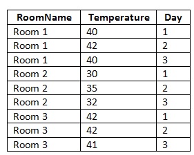
- example sample data
- Sample data table.jpg (28.25 KiB) Viewed 6632 times
I created a chart with a series and mapped the following properties of the series
ValueDataColumn = table.Temperature
ArgumentDataColumn = table.Day
AutoSeriesKeyDataColumn = table.RoomName -> I know that I can plot multiple rooms in one graph (one series per room)
However, I would like to create one graph per room (Room 1, Room 2, Room 3), so that my report will have three graphs rather than one, is this possible? and how would I do it?
Thanks,
Re: Chart Constant Lines/Strips/Conditions
Posted: Wed Mar 12, 2014 6:41 am
by HighAley
Hello.
Please, read the
Report with Chart in Data Band section of the Stimulsoft User Manual.
Thank you.
Re: Chart Constant Lines/Strips/Conditions
Posted: Wed Mar 12, 2014 7:42 am
by HighAley
Hello.
We have added the same value to the Orientation property of the Strips. It will be available in our next prerelease build on March 14.
Thank you
Re: Chart Constant Lines/Strips/Conditions
Posted: Wed Mar 12, 2014 12:45 pm
by HighAley
Hello.
We have fixed issue with the label of Constant lines. In our next prerelease build it will be visible in any placement.
We are sorry to say that it is not possible to fix problem with range of right Y axis.
Thank you.
Re: Chart Constant Lines/Strips/Conditions
Posted: Thu Mar 13, 2014 1:56 am
by NadinW
Thanks for the fixes.
I was aware of using data bands with chart. But that only works if we have two data tables one with unique names or IDs (i.e. Categories in the manual) and another table with the values to plot (i.e. Products in the manual) with a relation defined.
Unfortunately I only have one data table that has all the information, with multiple rows per Room Name, so the data band in this case wouldn’t work, and if I use the same data source for both the chart and the data band then I would end up with 9 graphs rather than 3.
Would it be possible to create a chart per item (Room name) from one data table?
Re: Chart Constant Lines/Strips/Conditions
Posted: Thu Mar 13, 2014 6:57 am
by HighAley
Hello.
Please, try to use Group Header Band to group Data band by rooms. Then you can put chart on this Group Header or on a Group Footer. In this case there will be no repeated charts.
Thank you.